
You know that kitchen. The one on your feed with the marble backsplash running clean to the ceiling, the brass faucet, the cabinets in that soft warm white that somehow reads as money. You save it. Then you look at your own kitchen — the laminate counter with the scorch mark, the oak cabinets from another era — and you think: okay, so how do normal people get anywhere near this?
Here's what I've learned after doing this a few times, including one remodel I badly botched: the expensive look has almost nothing to do with how much you spend. It's the opposite of what you'd guess.
The kitchens that look cheap and the kitchens that look expensive are frequently within a few hundred dollars of each other in materials. What separates them is a handful of decisions — repetition, proportion, restraint, and the discipline to stop. Budget kitchen remodel ideas that look expensive are not about buying cheaper versions of luxury things. They're about removing the visual noise that screams "I ran out of money halfway."
I'll show you exactly which swaps deliver that effect, which ones backfire, and where I personally wasted money so you don't have to repeat it.
Key Takeaways
- Perceived luxury comes from consistency and restraint far more than from expensive materials.
- Three or four high-impact changes — usually backsplash, hardware, lighting, and paint — do the heavy lifting.
- Fake stone chosen badly looks worse than honest laminate chosen well. The material matters less than the finish and repetition.
- The single most common budget mistake is doing too many things at once in too many finishes.
- A $3,000–$4,000 spend can read as five figures if you protect your sightlines and limit your palette.
- Lighting is the highest return per dollar of anything in the room. Most people skip it entirely.
Why some cheap kitchens look rich (and yours doesn't yet)
A kitchen that looks expensive is a kitchen your eye can read without effort. That's the whole trick. When every surface, tone, and line agrees with its neighbors, your brain stops scanning for problems and just registers "calm, considered, good." Calm reads as expensive. Busy reads as cheap.
I learned this the hard way. On my first attempt, I painted the cabinets white, added a mosaic glass backsplash with brown and amber tiles, swapped the hardware for brushed nickel, and put a dark laminate floor underneath. Individually, every choice was fine. Together, it was a mess. Three finishes, four tones, no anchor. A friend walked in and said, "It's nice!" in the tone people use for a haircut they don't like. She was right.
The second time, I did less. Same cabinet color. A plain white subway tile in a matte finish. Matte black hardware, identical everywhere. One wood floor, warm, running the same direction throughout. Total materials cost was lower than the first attempt. Everyone who saw it assumed I'd hired someone.
The consistency rule that does most of the work
Pick a maximum of two metals and one dominant color family, and then repeat them until it feels slightly boring. Metal counts include hardware, faucet, light fixtures, and any visible appliance trim. Two is the limit. If your faucet is chrome, your hardware is brass, and your light is brushed nickel, you have already lost — no amount of nice tile will fix it.
Repeating a finish is what makes a design feel intentional. Intentional reads as expensive. This is why designer kitchens often look almost empty of ideas. They aren't. They're just ruthlessly consistent.
Proportion beats price every time
A $6 tile installed in the wrong proportion looks like a $6 tile. The same tile installed floor-to-ceiling, with the grout lines aligned to the cabinet edges, reads as a feature wall. The material didn't change. The framing did.
- Backsplash tiles that stop mid-wall draw a hard line your eye can't unsee — run them up or stop at a natural point.
- Hardware that's too small for the drawer looks like a placeholder.
- A single oversized pendant over an island looks deliberate; three undersized ones look like an afterthought.
- Grout in a contrasting color highlights every imperfection. Match it to the tile and the surface reads as one slab.
None of these cost extra. They cost attention.
The swaps that actually deliver the expensive look
If you do only a few things, do these in order. I've ranked them by how much perceived value they add per dollar, based on what actually moved the needle in my own kitchens and in the ones I've helped friends plan.
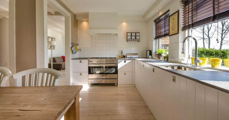
Backsplash: imitation stone done right beats real stone done wrong
Here's where most people overspend on the wrong fork. You can buy a marble-look slab, a real marble slab, or a large-format porcelain that mimics stone. Real marble is beautiful and also a nightmare — it etches, it stains, it wants your attention forever. The porcelain version, if you pick a slab with a subtle, low-contrast vein pattern, is nearly indistinguishable on a wall at normal viewing distance.
The trap is choosing the loudest fake. High-contrast, heavily veined imitation marble with an obvious repeating pattern is the single fastest way to look cheap. The vein has to be quiet and irregular. One honest rule: if you can spot the repeat from three feet away, it's not working.
Hardware and faucet: buy the profile, not the price tag
Solid brass bar pulls are gorgeous and expensive. A matte black or brushed brass-plated pull in a simple bar or cup profile, bought in a 25-pack, is a fraction of that and reads the same from across the room. Where the money shows is in the shape and the finish consistency, not the metallurgy.
What I got wrong early on: mixing finishes "for interest." No. Buy one profile, one finish, one size per drawer type, and repeat. A bar pull on every drawer looks calmer than a bar pull here and a cup pull there. Calm looks expensive. Variety doesn't.
One real splurge worth considering: the faucet. It's the object you touch and look at most, and a well-proportioned one in a solid finish punches above its weight. I spent $180 on mine and people assume it cost three times that.
Lighting: the highest return per dollar in the room
Nobody renovating a kitchen on a budget spends on lighting, and it's the biggest missed opportunity. Bad lighting makes good materials look cheap; good lighting makes cheap materials look intentional. Warm layers under the cabinets, a dimmable main fixture, and a single task light over the sink change the whole mood of a room for maybe $150 in total if you do it yourself.
Two things matter. Color temperature: keep it warm, around 2700–3000K, everywhere. Mixing a cool white light with a warm one in the same room is instantly visible and instantly cheap. And layering: one ceiling light alone flattens everything. Two or three sources at different heights create depth, and depth is what photographers call "the expensive look."
Cheap vs "expensive-looking": the numbers side by side
Here's the comparison I wish someone had shown me before I spent anything. These are realistic material costs for a typical small-to-mid kitchen; your local prices will vary, but the ratios hold.
| Element | What looks budget | Typical cost | What looks expensive | Typical cost |
|---|---|---|---|---|
| Backsplash | Small mosaic, contrasting grout | $90 | Large-format porcelain, matched grout | $220 |
| Cabinet hardware | Mixed finishes, assorted sizes | $40 | One profile, one finish | $110 |
| Faucet | Builder chrome, thin spout | $60 | Single-handle, solid finish | $180 |
| Cabinet finish | Brush-painted, visible strokes | $120 | Rolled matte, sprayed look | $160 |
| Lighting | One ceiling fixture | $60 | Layered, warm, dimmable | $150 |
| Counter | High-gloss laminate | $180 | Matte-look laminate or edge-banded butcher block | $340 |
The total gap between the two columns is under a thousand dollars, and the right column reads as a completely different kitchen. That's the entire point. You're not choosing between cheap and expensive. You're choosing between cheap-looking and cheap-and-looks-expensive, and the price difference is smaller than you'd expect.
Where the money actually goes
If you're working with a hard ceiling of a few thousand dollars, the split I'd use is roughly this: half on surfaces you touch and look at daily (counter, faucet, hardware), a third on the things that change how the room feels (paint, lighting, backsplash), and the remainder as a buffer for the thing you didn't plan for. There's always a thing you didn't plan for.
On my second kitchen, I budgeted $3,200. I spent $3,640. The overage was almost entirely tile adhesive and a plumber's visit I hadn't anticipated. Keep 10–15% back or you'll be choosing between finishing the job and finishing it properly.
The mistakes that quietly expose your budget
You can spend well and still look cheap, because a few specific errors undo everything else. These are the ones I see most, including one I committed.
- Too many finishes. Two metals, one color family. That's the ceiling. Break it and the room reads as work-in-progress.
- High-gloss surfaces everywhere. Gloss reflects every smudge and every uneven surface. Matte hides imperfection, and hiding imperfection is the whole game.
- Cheap caulk lines and unfinished edges. A $9 tube of paintable caulk and a clean bead around the counter is the difference between "renovated" and "still renovating." Nobody notices good caulk. Everybody notices bad caulk.
- Removing the cabinet doors and calling it open shelving. The inside of a builder-grade cabinet is not shelf-worthy. The brackets are visible, the particleboard is bare, and it looks exactly like what it is.
- Bright white paint on everything. Pure white looks clinical under cool light. A warm off-white reads as considered and gives you room for contrast.
Here's the one I got wrong, so you can avoid it. I once tried to save money by painting over the existing laminate counter with a stone-look coating kit. The result looked fine for about three months. Then it started wearing at the sink edge, exactly where the eye goes when you're standing there doing dishes. Every time I saw that worn patch, I knew. So did everyone who visited. Sometimes the honest cheaper material — a matte laminate with a clean edge band — looks better because it looks like a decision, not a cover-up.
The rule that saves you from yourself
When in doubt, stop adding. Almost every time I've pushed a kitchen budget over the line, it was because I added one more element "for interest" rather than removing something. The expensive look is subtractive. You're not decorating. You're editing.
Plenty of small kitchens, no wasted moves
Small kitchens are where this approach pays off most, because you have less room to hide errors. A few adjustments specific to tight spaces:
Run the backsplash and the counter in tones that are close to each other. In a small room, high contrast between horizontal surfaces makes the space feel chopped up. Keeping them in the same family makes the counter appear to continue into the wall, which reads as more surface area than you actually have.
Use the vertical dimension. Cabinets that run to the ceiling look custom; cabinets that stop with a gap above them look like a rental. If you can't afford to extend them, a simple filler panel in the cabinet color closes the gap and costs almost nothing at a lumber yard.
And light the corners. A dark corner reads as a small room; a lit corner reads as a designed one. Under-cabinet strips are cheap and they make the whole kitchen look deliberate.
Putting it together: a realistic $3,000–$4,000 plan
If you want the whole thing mapped out, this is the sequence I'd follow, and it's close to what I did the second time around.
- Paint the cabinets. Rolled matte finish, warm off-white, remove the doors and label everything. This is the single biggest visual change you can make. Budget a weekend and $160.
- Replace hardware with one consistent profile in one finish. $110. Takes an afternoon.
- Add layered lighting. Under-cabinet strips, a warm main fixture, a task light. $150 and an evening with a drill.
- Install the backsplash. Large-format tile or a large-format porcelain slab, matched grout. $220 in materials, and this is the job most worth paying a pro for if you've never tiled.
- Upgrade the faucet. $180, and it's the detail people touch.
- Handle the counter honestly. If it's worn, a matte-look laminate with a clean edge band at $340 beats a failing DIY coating every time.
- Caulk, touch up, and stop. This last step is where the expensive look actually lands. Clean lines are the payoff.
Add a buffer, and you're at $3,000–$4,000 with money left for the surprise. The kitchen that comes out of this looks like it cost considerably more, because every part of it agrees with every other part.
What actually matters when you're done
The kitchens that fool people aren't the ones with the best tile. They're the ones where nothing is fighting anything else. Two metals, one palette, surfaces that hide wear, light in the corners, and edges that are finished. That's it. That's the entire secret, and it costs less than the version you were nervous about buying.
So before you add another element "for interest," ask yourself the question I now ask every single time: does this make the room calmer, or busier?
Calm is what expensive looks like. Everything else is just stuff you bought.


